Resident Doctors of Canada
Creating a Cohesive National Brand
Project Overview
Resident Doctors of Canada (RDoC) represents over 10,000 resident doctors nationally. RDoC collaborates with other national health organizations to foster excellence in training, wellness, and patient care. Intent was engaged to reimagine their new brand and develop their website. RDoc wanted to ensure the new brand is inclusive, modern, sustainable long-term, and speaks to their key audiences.
The organization’s previous brand identity was generic, corporate feeling, and no longer represented the organization.
We had to keep in mind that RDoC has numerous audience groups, each with unique communications needs and objectives. To effectively communicate with each group, it was necessary for us that their needs be looked at individually.
Insight
The new brand needed to speak to their key audience, specifically the Provincial Housestaff organizations (PHOs) that make up RDoC’s membership. We saw this as an opportunity to create a unique brand that reflects a modern, approachable, professional tone—aiming to make resident doctors feel represented and supported.
Intent’s expertise in stakeholder engagement and management was required for the new RDoC brand to ensure the PHOs were included, listened to, and reflected in the development of the new identity.
Regular consultations with the PHOs were critical to the success of our work and was essential in ensuring our design approach was validated and representational of Resident Doctors across Canada.
Solutions
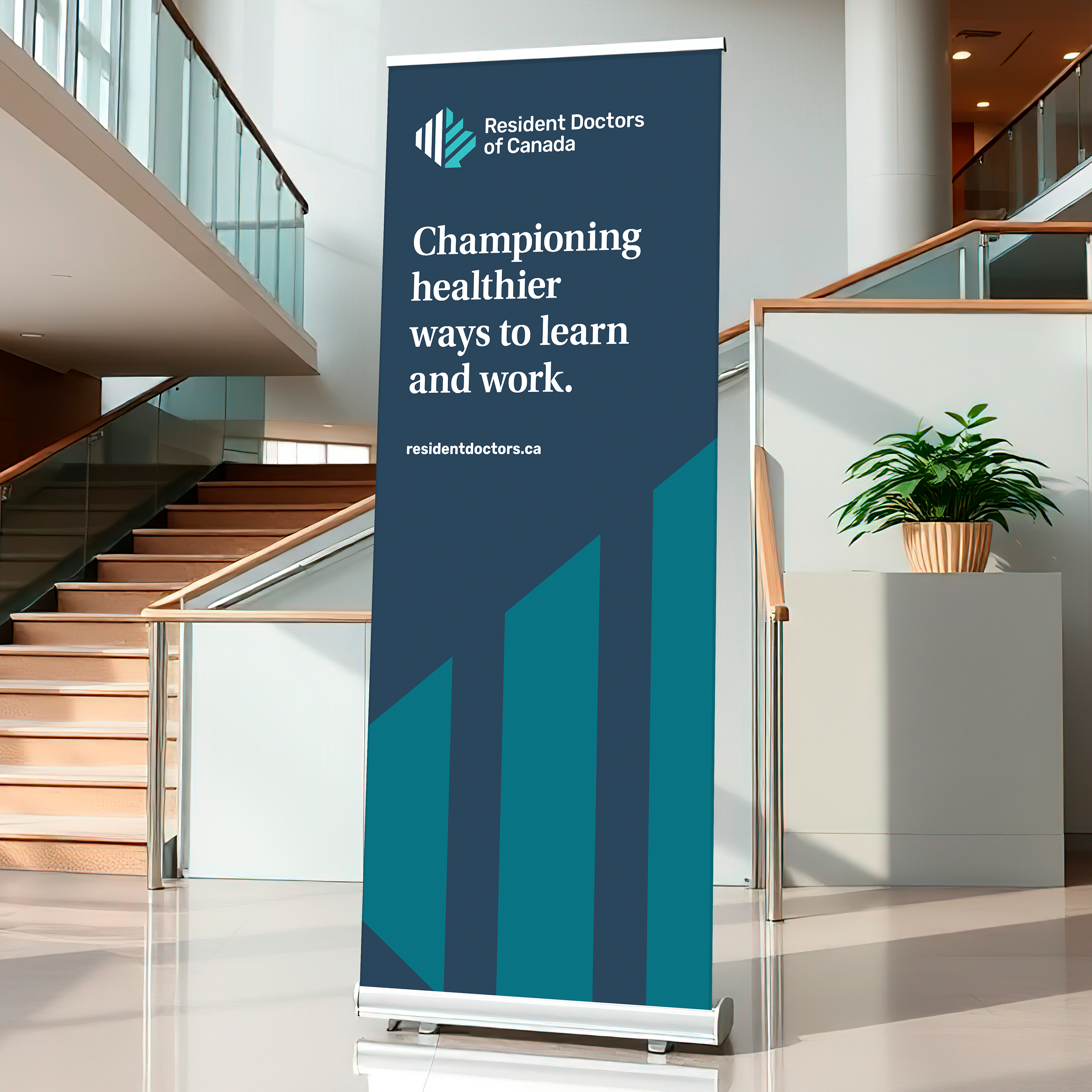
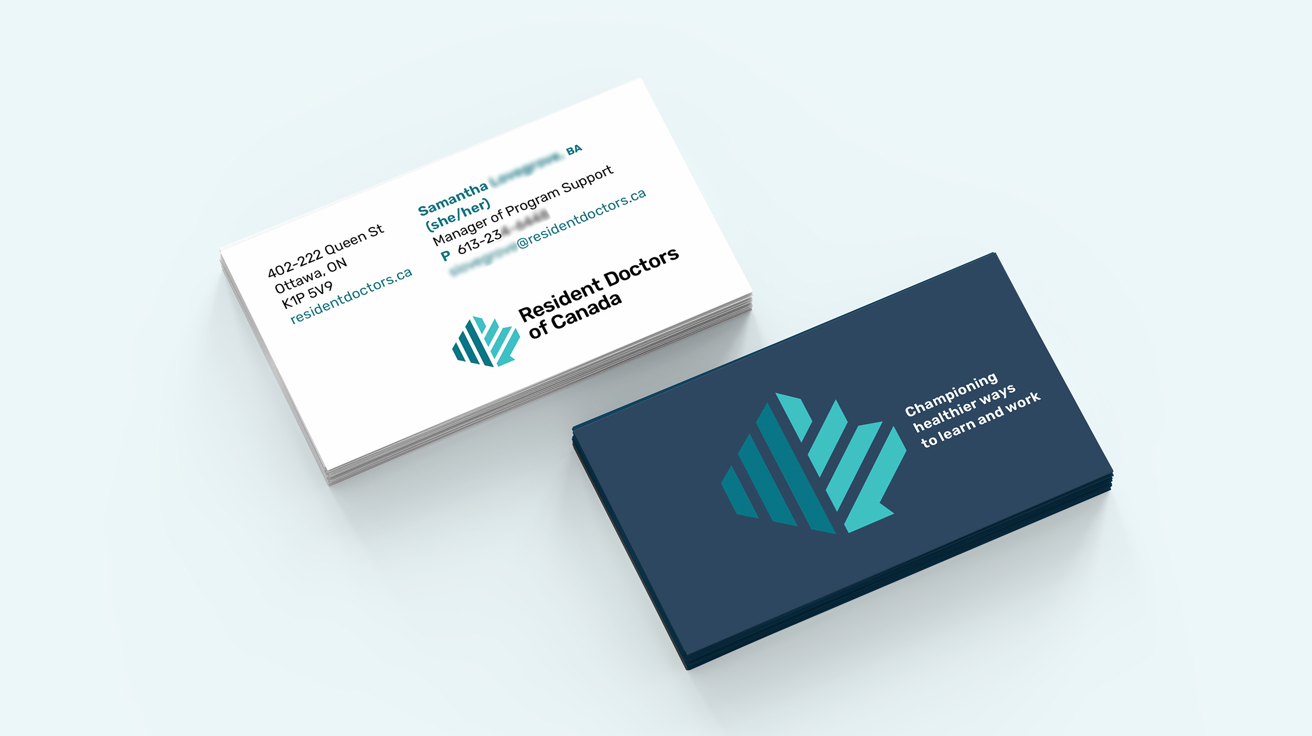
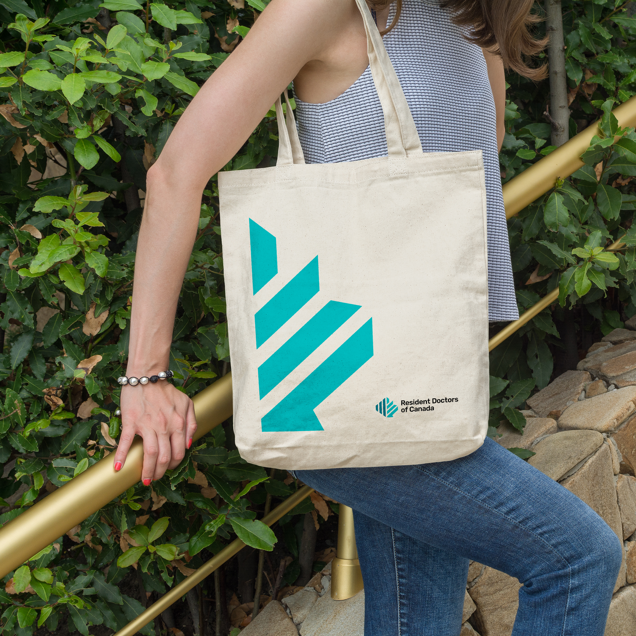
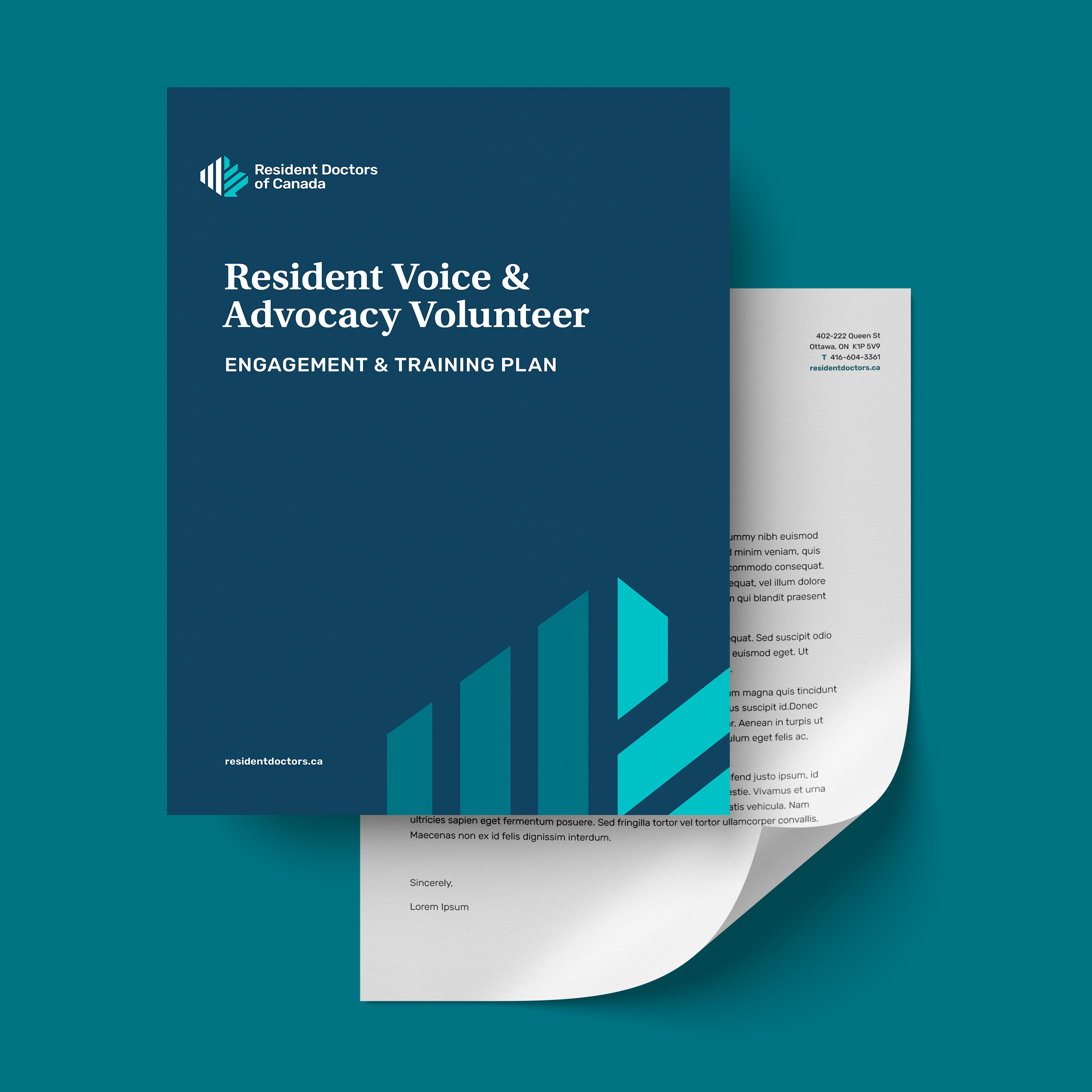
The new logo features a stylized maple leaf composed of sound waves being amplified, representing RDoC being the voice and advocate for PHOs.
The design system furthers this idea by emphasizing the upward trajectory of the maple leaf and is intentionally segmented to show the symbol is formed from several parts coming together (a nod to the Provincial Housestaff Organizations). The colours selected for the new brand are inviting yet vibrant. We extended the identity out to brand guidelines, social media collateral, as well as stationery design (business cards, PowerPoint presentations, and letterhead).
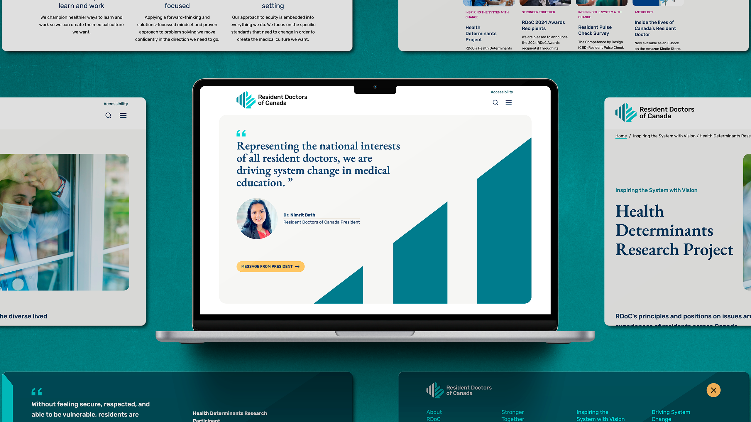
Intent is currently creating a new RDoC website to reflect the new brand and better serve users.
“RDoC’s new brand identity is a true representation of who we are today. Intent seamlessly guided our team through the branding process, intently listening and incorporating feedback every step the way. Their team’s established knowledge of the healthcare sector proved extremely useful as they were able to hit the ground running. They are easy to work with, accountable to deadlines, and always keep us updated on progress.”